
Story chapters
Every ringis a year.Every cell,a death.
Belgium Mortality Rings turns daily deaths from 1992 to 2025 into a cross-section that grows outward like a tree. The interactive wood preserves the count for every source day while colour records the distance from a recent seasonal baseline.
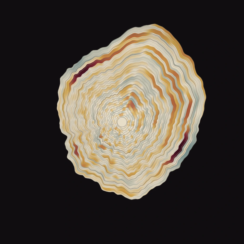
A tree keeps a diary in its trunk. This one keeps a country’s.
Cut a tree across the grain and its life lies open: broad years, narrow years and scars left by exceptional seasons.
This project borrows that grammar for Belgium’s mortality record. Each ring is one calendar year. Position gives the date, thickness follows the daily count, and colour shows a smoothed excess-mortality signal derived from the project’s weekly baseline.
Six rules hold the picture together.
Focus, hover or tap a rule to see it on the wood
The complete cross-section, 1992–2025.
Scrub through the years, play the growth, or select a ring to open its verified annual record.
In early April 2020, daily mortality rose far above its recent seasonal baseline and left the strongest spring mark in the record.
The browser view is a faithful daily-count reconstruction. Its sampled flecks are decorative; they do not claim to draw 3.65 million separate browser marks.
Where the grain breaks.
Eight periods that pushed mortality away from its recent seasonal pattern and left a visible mark.
The 2003 heatwave
The August 2003 heatwave coincided with a sharp mortality rise. Sciensano’s historical Be-MOMO series records 2,494 excess deaths across summer 2003; the ring is an all-cause signal, not a cause-of-death estimate.
Influenza and late-winter mortality
The late 2011–12 influenza season coincided with pronounced winter excess mortality. Sciensano reported 3,816 excess deaths for that winter; the chart alone cannot separate influenza, cold, air pollution or other causes.
A severe influenza winter
Influenza activity in winter 2014–15 coincided with pronounced excess mortality. Sciensano identifies it among the winters with excess mortality above 5%; this all-cause signal does not prove a single cause.
Influenza B and prolonged cold
The long 2017–18 influenza epidemic and a cold spell coincided with mortality remaining above expected levels into March. Sciensano estimated 3,093 excess deaths over the winter; all-cause monitoring cannot assign them to one factor.
COVID-19 · first wave
Belgium’s first registered COVID-19 wave coincided with the record’s steepest spring all-cause mortality surge. Sciensano compares registered COVID-19 deaths with Be-MOMO excess deaths; the ring itself remains an all-cause view.
Sciensano · excess mortality during Belgium’s first two COVID-19 waves ↗
Heat, mid-pandemic
Belgium’s August heat episode coincided with severe excess mortality during a low-COVID inter-wave period. Sciensano reported 1,555 excess deaths from 5–20 August and found temperature and air-pollution correlations; Be-MOMO does not establish individual causes.
COVID-19 · second wave
Belgium’s second registered COVID-19 wave coincided with a broader, sustained autumn all-cause mortality surge. Sciensano compares registered COVID-19 deaths with Be-MOMO excess deaths; the ring does not assign every death to COVID-19.
Sciensano · excess mortality during Belgium’s first two COVID-19 waves ↗
A summer of repeated heat
Four heat-warning periods in summer 2022 coincided with mortality often running above baseline. Sciensano explicitly cautions that Be-MOMO does not prove heat caused the excess; COVID-19 and other environmental factors were also present.
Read it as numbers, too.
The same record unrolled into charts. Choose a year to inspect its daily shape and compare it with all 34 rings.
Annual excess mortality
Observed deaths compared with the sum of the weekly expected baseline. Select a bar to open that year below.
Daily anatomy of 2020
Daily deaths against the source weekly expected baseline, shown as an expected daily rate.
Highest-excess periods
The weekly periods with the largest positive departures in the complete record.
The disc, unrolled.
Each line is one year’s distribution of daily death counts. Long right tails reveal unusually heavy days.
Hover a year to read it · filled by deaths per day
Deadlier than expected, or quieter?
Every recorded day flows from a single point — what the recent seasonal baseline predicted — and lands above the line when its centred seven-day mortality rate was higher, below when it was lower. The two sides nearly balance in number. They do not balance in force.
Twelve thousand source days, one plot.
One point for every recorded calendar day, positioned by date and daily deaths. Leap days remain distinct; each year is normalized once around the full circle.
A still, a sequence, a film.
The open pipeline grows the disc one year at a time. These stages show the record moving from pith to bark.
Built for one country. Ready for any daily series.
The source, transformation, verification rules and renderer are open for inspection and reuse.